Availability
Gamoshi Creative Studio is available for:
- DSP accounts running on the Gamoshi programmatic DSP.
- PE Enterprise accounts using internal DSP campaigns.
As one of the top DSPs offering built-in creative tooling, Gamoshi enables Creative Studio at the account level. Once it’s turned on, you’ll find it listed under Advertisers > Creative Studio. If you don’t see the menu item, reach out to your account manager and they’ll sort out access for you.
Table of Contents
- Overview
- Creative Studio Design Types
- Design Sizes
- Design List
- Design Statuses and Actions
- Create a Design
- Build a Banner Design
- Build a Survey Design
- Use a Design in a Creative
- Update Associated Creatives
- Creative Studio Delivery
- Quick Reference
Overview
Creative Studio lets you build reusable design templates and attach them to multiple creatives at once, which saves a lot of repetitive work when you’re managing more than one ad campaign at a time.
A design controls how an ad looks and behaves its images, text, colors, sizes, and overall layout. Survey designs go a step further and also define the individual survey pages, the possible answers, and the path a user takes through them.
A creative, on the other hand, is what actually serves the ad out into the ad marketplace. When you build a creative from a Creative Studio design, the platform takes care of generating the HTML automatically, so there’s no manual coding involved on your end.
You can create, edit, and preview designs under:
Advertisers > Creative Studio
Keep in mind that previewing a design doesn’t put it live in front of an audience. A design only starts showing once it’s linked to a creative that’s running in an active campaign, and that creative is being delivered through Gamoshi’s real time bidding algorithm across connected ad exchange programmatic inventory.
Creative Studio Design Types
Creative Studio currently supports two design types.
| Design type | Description |
|---|---|
| Banner Studio | Creates an image-and-copy display banner in supported sizes. |
| Survey | Creates a multipage interactive survey or poll. |
Design Sizes
Each design includes:
- One main size.
- Up to four additional supported sizes.
The main size is what determines how the design gets built out and how it appears in the primary preview.
Every size you configure can be previewed right inside Creative Studio. Once the design is attached to a creative, all of its configured sizes become available for that creative to use and you’re free to remove whichever sizes you don’t actually need.
Design List
Head to Advertisers > Creative Studio to see the full list of designs you’ve already created.
You can narrow the list down by:
- Design name.
- Design Type: Banner Studio or Survey.
Click Clear Filters if you want to remove whatever filters you’ve applied.
Designs List Columns
| Column | Description |
| Design ID / Design Name | The identifiers displayed when selecting a design for a creative. |
| Design Type | Banner Studio or Survey. |
| Main Template | The primary size for which the design was created. |
| Additional Sizes | The additional sizes in which the design can serve. |
| Associated Creatives | The number of creatives using the design. Select the number to open those creatives. |
| Updated Date | The date of the most recent edit. |
| Status | Draft, Published, Paused, or Archived. |
| Publish | Controls whether the design is published. |
A warning icon shows up when a design has changes that haven’t been pushed through to its associated creatives yet.
Design Statuses and Actions
Design Statuses
Draft
Every new design starts out with Draft status.
Draft designs are still a work in progress, so they can’t be selected for a creative until they move past this stage.
Published
Published designs show up as available options when you’re creating or editing a creative.
Paused
Pausing a design stops it from being added to any new creatives, but the creatives already running on it will keep going without interruption.
Archived
Archived designs disappear from the standard design list and can’t be picked for new creatives. Any creatives that were already built on an archived design will keep delivering normally.
Publish Switch
The Publish switch moves a design between Draft, Paused, and Published status.
This switch only controls whether the design is available for selection it doesn’t touch the version currently being used by the creatives already associated with it.
Design Actions
| Action | Description |
| Edit | Opens the design builder. |
| Duplicate | Creates a separate copy of the design as a new Draft named “Copy of…”. |
| Push Latest Version to Creatives | Regenerates the content of all associated creatives using the current design. This option is available when the design has unpublished changes. |
| Archive | Removes the design from selection while leaving associated creatives unaffected. |
Create a Design
Click + New Design, then pick either:
- Banner Studio
- Survey
Note that once you’ve chosen a Design Type, you can’t switch it later on. If you need the other type, you’ll have to start a fresh design.
Design Builder
The builder is split into two main areas:
- Form: Where all the design settings live.
- Preview: A live preview that updates in real time as you make edits.
The preview shows the design at its main size. If the design is bigger than the preview panel, it’ll get scaled down and you’ll see the scale percentage displayed. There’s also a “Preview sizes” switch you can enable to check out the additional supported sizes. Hit Refresh any time you want to manually re-render the preview.
Load an Example
If you’re starting a new design, select Load Example to auto-populate the builder with a pre-built example Retail, Travel, and Brand Lift are among the options.
Feel free to tweak the example however you like before using it as your starting point. Nothing gets saved permanently until you hit Save.
Design Actions
You’ll find these actions sitting at the top of the builder:
- Cancel
- Save
- Save & Update Creatives, which shows up once the design has associated creatives.
Configure Design Sizes
For Banner designs, choose the primary size under the Main Template. For Survey designs, that same choice lives under Main Asset Size.
Use Supported Sizes to add up to four more sizes on top of the main one. Turn on Preview Sizes if you want to see previews of every additional size stacked below the main preview.
Examples of Available Banner Templates
| Template | Size |
| Medium Rectangle | 300 × 250 |
| Leaderboard | 728 × 90 |
| Skyscraper | 160 × 600 |
| Mobile Banner | 320 × 50 |
| Mobile Interstitial | 320 × 480 |
| Mobile Landscape Interstitial | 480 × 320 |
| Billboard | 970 × 250 |
| Square | 1200 × 1200 |
Build a Banner Design
Work through the Banner Studio form from top to bottom the preview will keep updating as you go, so you can see exactly how each change affects the design.
Content Settings
| Field | Description |
| Name | Required internal name for the design. |
| Main Template | Required primary size. |
| Supported Sizes | Up to four additional sizes. |
| Headline | Main line of text. |
| Body Text | Secondary text. |
| Click Action | Determines whether the entire banner or only the CTA button is clickable. |
| CTA Text | Button label. The default is “Learn More.” Required when only the CTA is clickable. |
| Ad Label | A small label, such as “Ad” or “Sponsored,” displayed when Show Ad Label is enabled. |
| Disclaimer | Small-print text. |
A Banner design needs to contain at least an image or some Headline/Body Text it can’t be left completely empty.
Background, Image, and Logo
The background can be either an image or a solid color, but not both at once.
Background Image
Paste in an image URL, or select Choose to pull from one of your uploaded images.
Use the Image Opacity setting to control how visible the image is. Set it to 100% and the image displays at full opacity, which also means the background color won’t show through underneath it.
Background Color
Pick either a solid color or a gradient. You’ll need a background color whenever the design doesn’t already have a background image.
Logo
Add a logo URL, or select Choose to grab one from your uploaded files.
Layout Settings
Content Position
Use the 3 × 3 position grid to anchor where the text block sits.
Selecting an adjacent cell in the same row lets you extend the content across two cells, or you can select the full row across all three cells.
CTA Position
By default, the CTA sits right alongside the content.
If you want it placed independently, turn on Position CTA Separately and assign it its own spot using the same grid.
Image Fit
Choose how the image should fit within the design:
- Cover: Fills the available space, cropping the image as needed.
- Contain: Shows the entire image within the available space.
- Auto: Applies automatic sizing.
Overlay
Add an overlay to help text stand out over an image:
- Gradient Dark.
- Gradient Light.
- Band.
- Solid.
- None.
Colors and Styles
Pick a Preset to set the design’s overall look:
- Light.
- Dark.
- Warm.
- Vibrant.
If you want more control, turn on Show Style Overrides to adjust individual settings by hand. Overrides are entirely optional, and you can hit Clear any time to reset a setting back to its Preset value.
Available color settings include:
- Headline.
- Body.
- CTA Background.
- CTA Text.
- Disclaimer.
- Ad Label Background.
- Ad Label.
Available Headline and Body fonts include:
- System.
- Montserrat.
- Roboto.
- Open Sans.
- Inter.
Keep in mind the System font pulls from whatever font is available on the viewer’s own device, so its look can vary from one device to another.
These style settings accept free-text values, like 6px or 1px solid #ccc:
- CTA Border Radius.
- CTA Border.
- Ad Border.
- Ad Border Radius.
- Logo Border Radius.
- Text Shadow.
- Logo Shadow.
Banner Validation
You won’t be able to save the design if:
- The Name field is empty.
- No Main Template has been selected.
- The design has no image, Headline, or Body Text.
- The design has neither an image nor a background color.
- The Click Action is set to CTA-only and the CTA Text field is empty.
Any validation errors will show up at the top of the form so you know exactly what to fix.
Build a Survey Design
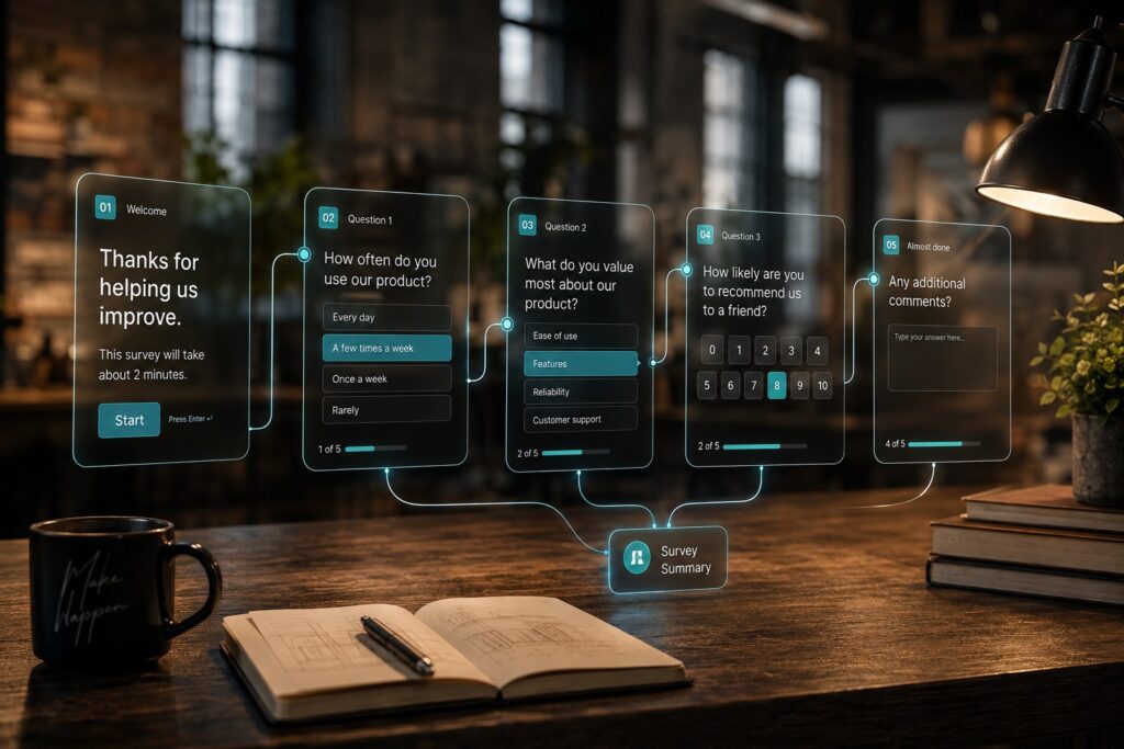
A Survey design is made up of a sequence of pages, and each one presents a question along with a set of possible answers.
Every answer determines what happens next whether that’s opening another page, jumping to a landing page, wrapping up the survey, or closing the ad entirely.
Survey Flow Map
The flow map sits above the form and gives you a visual of:
- The Survey pages.
- The answers on each page.
- The action tied to each answer.
Click on any page in the map to jump straight to its settings.
A dashed red connector means an answer doesn’t have a destination assigned yet, and that needs fixing before you can save the design. You can select Hide Map or Show Map to collapse or bring back the map view.
General Survey Settings
| Setting | Description |
| Main Asset Size | Required primary size for the Survey design. |
| Supported Sizes | Up to four additional sizes. |
| Background | An image or color, but not both. |
| Global Font | System, Montserrat, Roboto, Open Sans, or Inter. |
| Question Color | Color of the question text. |
| Supporting Text Color | Color of the secondary text. |
| Answers Color | Color of the answer text. |
| Answers Background Color | Background color of the answer buttons. |
| Environment | Web, in-app, or both. |
| Responsive | Fixed, Scale to Fit, or Responsive. |
| Start Page | The first page shown to the viewer. |
| Chrome | Optional Progress Bar, Close button, and Sponsored label and text. |
| Logo | An image URL or an image selected from uploaded files. |
| Form Submit Event | The tracking event triggered when the viewer reaches the Finish action. |
Survey Pages
Select + Add Page whenever you want to add another page. A Survey can hold up to 10 pages total, and you always need to keep at least one page in place.
Click a page header to expand or collapse it, or select Remove if you want to delete it entirely.
| Field | Description |
| Name | Internal page name displayed in the flow map and destination selectors. |
| Type | Question or Completion. |
| Page Style Override | Optional colors, background, and font settings for the specific page. |
| Question / Headline | Question text or the Headline displayed on a Completion page. |
| Supporting Text | Secondary text displayed below the Question or Headline. |
| Answer Layout / Button Layout | Vertical, Horizontal, Grid, or Grid-3. |
Page Style Overrides swap out the Survey’s default styling just for that one page. Any setting you don’t override will keep using the Survey-wide defaults.
You’ll see an Active indicator whenever a page has overrides applied. Select Reset to Survey Color if you want to clear an individual color override.
Survey Answers
Each page can hold up to six answers. On a Completion page, answers are optional and act more like buttons.
For each answer, you can configure:
- Answer Label: The text shown to the viewer.
- Event: An optional tracking event fired when the answer gets selected.
- Action: What happens next in the Survey.
Available events are:
- Custom Event 1–5.
- Form Submission.
Available actions are:
| Action | Result | Additional setting |
| Go to Page | Opens another Survey page. | Destination page |
| Open URL | Opens a landing page. | URL |
| Open URL and Continue | Opens a landing page and proceeds to the next page. | URL |
| Open URL and Finish | Opens a landing page and ends the Survey. | URL and optional Completion page |
| Finish | Ends the Survey. | Optional Completion page |
| Exit | Closes the ad. Intended mainly for Completion pages. | None |
Preview a Survey
Use the previous and next arrows in the preview panel to click through pages without having to select any answers yourself.
The Page x/y counter tells you which page you’re on and how many pages there are in total.
Survey Validation
Errors show up at the top of the Survey form and will block you from saving until they’re resolved. Common ones include:
- A page has no Question or no answers.
- An answer has no Action.
- An Action is missing a required destination page or landing-page URL.
- An answer points to a page or Completion page that’s since been deleted.
- A page can’t be reached from the Start Page.
- A page has no path leading to Finish or Exit.
- The background is set to image or color, but no actual value has been chosen.
- A landing page or tracking URL is invalid.
Warnings show up in yellow and won’t stop you from saving. Examples include:
- The Survey doesn’t have a Completion page.
- The same Custom Event is being used in more than one place.
- A placement size might be too small for comfortable interaction.
Use a Design in a Creative
A design can’t serve on its own; it has to be attached to a creative first. Here’s how to use a Creative Studio design:
- Open an existing creative or start a new one.
- Select Banner as the Media Type.
- Select HTML as the Creative Template.
- Under Creative Design, choose Use Creative Studio Design.
- Under Select Creative Studio Design, pick the design you need.
- Confirm the Ad Size filter it’s automatically filled in based on the sizes configured in the design.
- Enter the creative’s Click URL.
- Save the creative.
Creative previews always open landing pages in a new tab, so testing your ad campaign links won’t disrupt your current session.
Update Associated Creatives
Just editing and saving a design won’t automatically push those changes to its associated creatives updates have to be applied on purpose.
Update All Associated Creatives from the Builder
Select Save & Update Creatives to:
- Save the design.
- Regenerate the content of every associated creative.
- Apply the update immediately to live creatives.
You’ll get a confirmation message showing how many creatives were affected.
Update All Associated Creatives from the Design List
Select Push Latest Version to Creatives from the design’s row actions. This rolls out the current design version across all associated creatives in one go.
Creative Studio Delivery
Designs built in Creative Studio are meant to run through the Gamoshi platform, the same programmatic DSP that powers the real time bidding algorithm behind your campaigns.
When a design is attached to a campaign creative and delivered through Gamoshi, it displays exactly as it was configured.
Creative Studio designs won’t display correctly if they’re copied over to another advertising platform or served independently outside of Gamoshi’s ad exchange programmatic environment. If you’re comparing Gamoshi against other top DSPs or trying to figure out the best DSP for your setup, it’s worth remembering that Creative Studio designs are built specifically to work within this ad marketplace; they aren’t a portable, platform-agnostic format.
If the associated campaign or account gets stopped, its creatives will stop displaying too.
Quick Reference
Limits
| Setting | Limit |
| Additional supported sizes per design | 4 |
| Survey pages | 10 |
| Answers per Survey page | 6 |
Tracking Events
The builder supports:
- Custom Event 1–5.
- Form Submission.
Check with your account manager to confirm which URL each Custom Event is tied to for your account.
Terms
| Term | Meaning |
| Design | A reusable template created in Creative Studio. |
| Main Template / Main Asset Size | The primary size in which the design is built and previewed. |
| Supported Sizes | The additional sizes in which the design can serve. |
| Associated Creatives | Creatives currently built from the design. |
| Publish | Makes the design available for selection by creatives. |
| Push Latest Version / Save & Update Creatives | Applies the current design content to associated creatives. |